

Ride & Roll is designed for UX Design Institute, showcasing complete cycle of UX design process from scratch.
UX Research
UX/UI Design
Strategy Design
Prototyping
Usability Assessment
Figma, FigJam, Protopie, Miro, Google Forms, Reflector 4, ScreenFlow

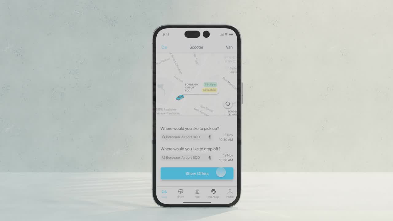
App welcomes user with results and info about deals, promotions and price visualized on map based on location of the user. Top bar lets user to reach intended vehicle type with one tap.
On-category complementary services in card view.
Flows are layered in a way that the interface is continuously redirectable and allow for interruption in sync with user’s mental model. Seamless transition from text-based search to map-based search. The micro task layers slide over the main content, keeping redirectability maximum.
First pick up text field appears, once it is filled the drop-off field reveals. Interface guides user by revealing only context relevant text fields.
Visualising the data: The results are shown with car pictures and main features of the car are shown in symbols.
Filter button as FAB: “Filter” prioritised by moving to easy-to-reach screen area as floating action button
The filtering elements are chunked under titles; the sliders and choice chips are used where applicable.
Drop off location and dates are populated once pick-up location is selected. Pushing secondary use case forward: checking price
One-screen based, date and time pickers smooth transition between interdependent micro tasks.

Up-to-date total sum on the CTA The list items shifting to obvious active state.
Log in flow is pushed to the end.
Query can be edited even on the final screen.
Only key data points are shown, the rest is chunked behind “Show more”.
Leading wording of screen and button title informing about next steps
CTA titles keep changing in response to shifting context.
A comprehensive UX research process is executed to conduct multi-sourced data collection. Then data triangulation is applied to corroborate findings, unveiling patterns across multiple data touchpoints. Subsequently, research findings are strategically synthesized, getting translated into actionable insights.

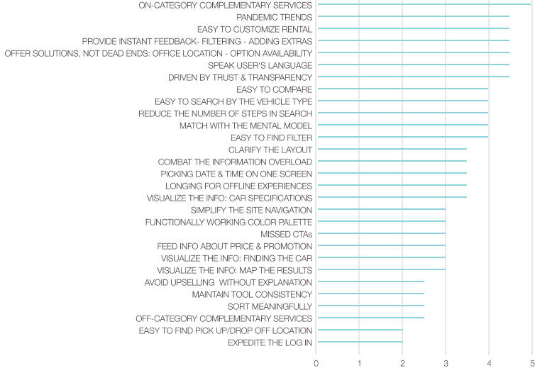
Affinity diagramming session is facilitated in person to prioritise the actionable insights. The gleaned data is used to infer design approaches. The inferred design approaches are rated on a 5-point Likert scale revealing the prioritisation of the design approaches.
The research findings are mapped along the customer journey, visualising the research process through diagramming. The user flow is detailed step by step and elaborated in terms of Goals, Context, Behaviors, Positive Interactions, Emotional Experience, Pain Points, Mental Models. Later in the process, the Customer Journey Diagram served as backlog for the Flow Diagramming.

Design Process started with low-fi ideation, consisting of flow diagramming the happy path to set out the requirements for each screen, and then sketching out the flow to explore multiple solutions rapidly. Then the fidelity level is quickly cranked up to be able to collect meaningful insights from stakeholders, deploying the concept through prototyping. The final concept is detailed and documented through wireframe building with annotations.
Through flow diagramming, a happy path is intricately constructed, using CJM as backlog. The flow diagram is constructed in a way that it reaches beyond a simple task flow, already incorporating preliminary page titles, underscoring key links taking user to other screens, ultimately facilitating the generation of initial screen drafts..

Based on Flow Diagram, the initial screens are sketched out, ideating about solutions for detected pain points, actionable insights and inferred design approaches from UX Research and Analysis Process. These sketches serve as a canvas for ideating, addressing the pain points and translating actionable insights into tangible design approaches. Initial ideation is intentionally kept in low-fi to be able to generate multiple solutions rapidly. Discerning that simple static sketches alone wouldn't suffice for comprehensive ideation, when it comes to ideating over a user flow which is obviously by nature is far from being static. So rather than settling for static sketches, a low-fidelity clickable prototype is crafted using these initial screens. This interactive prototype acts as a vital tool for gathering valuable initial insights -maybe not from end-users due to lack of fidelity but-from teammates with design affinity, enriching the design process with diverse perspectives.

The final screens are generated in Figma, employing interactive components at the variants level. Figma's interactive components provided the foundation for establishing the core functionality of micro-interactions. However, to achieve a highly realistic and interactive prototype, the screens are transferred to Protopie. An interactive prototype is built based on trigger response flow principles of Protopie.

Affinity diagramming session is facilitated in person to prioritise the actionable insights. The gleaned data is used to infer design approaches. The inferred design approaches are rated on a 5-point Likert scale revealing the prioritisation of the design approaches.

